THE PROBLEM
Born in the ‘80s, Pulsar’s Seiko watch was ready for a modern revival. The brand needed a fresh campaign that would appeal to the digital generation. “Life. In Real Time,” captured the energy of the fan base and reflected today’s sharable times in a personal way.
THE SOLUTION
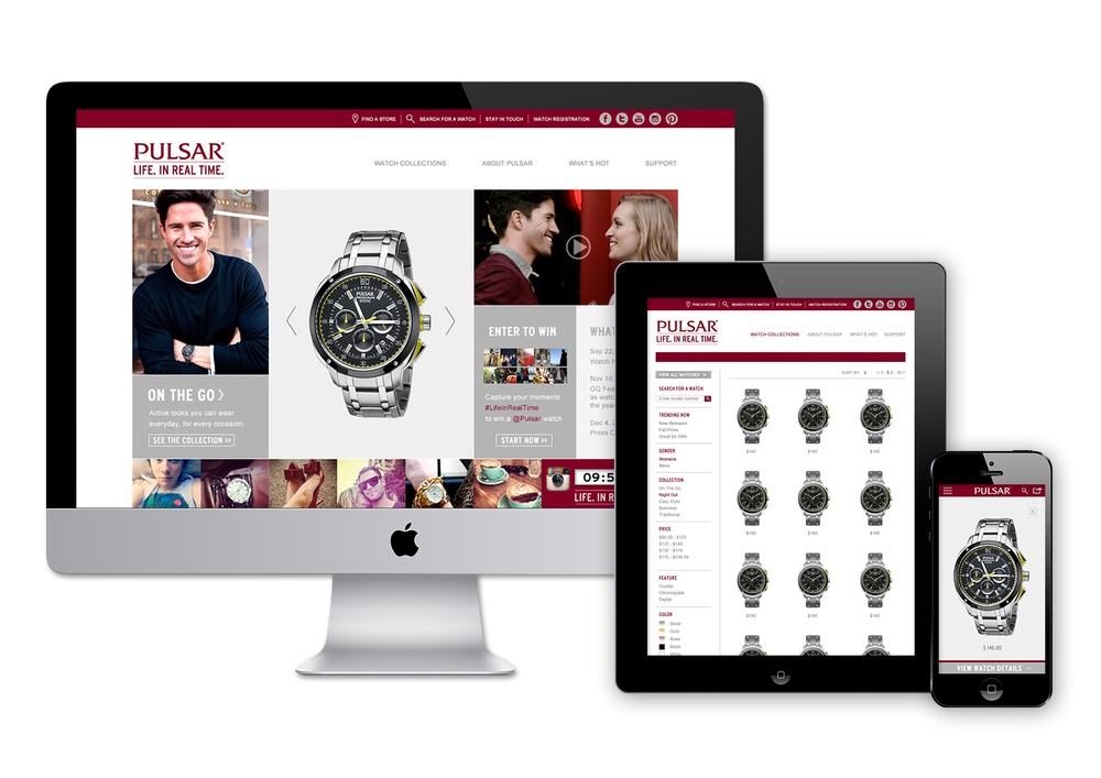
A modern responsive e-commerce website, Facebook tab and Instagram contest brought Pulsar to life as a distinct and relevant choice, just in time for Millennials to take notice.
TEAM
Mishele Wells (Creative Director), Robin Bates (Strategist), Rebecca Park (Junior Designer). Raphael Nunberg and No Format team (Development), Thu Do (IA/UX/UI/Product Manager.)
MY ROLE
Information Architecture / User Experience Lead / User Interface Design Lead / Product Manager
LIVE LINK


Requirement Setting

Responsive
e-commerce
+ social campaign
REQUIREMENT CRITERIAS
Through the stakeholder interviews and requirements gathering process, we aligned on the follow features:
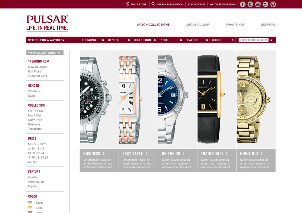
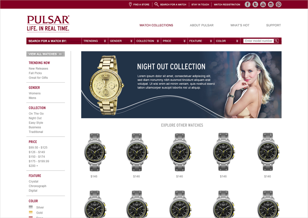
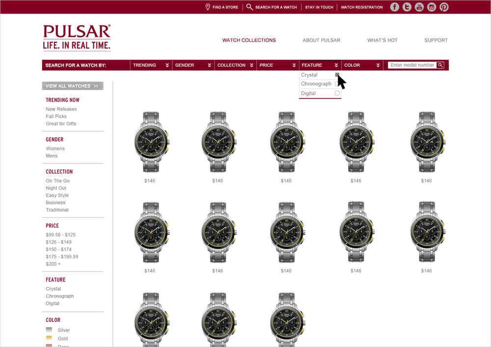
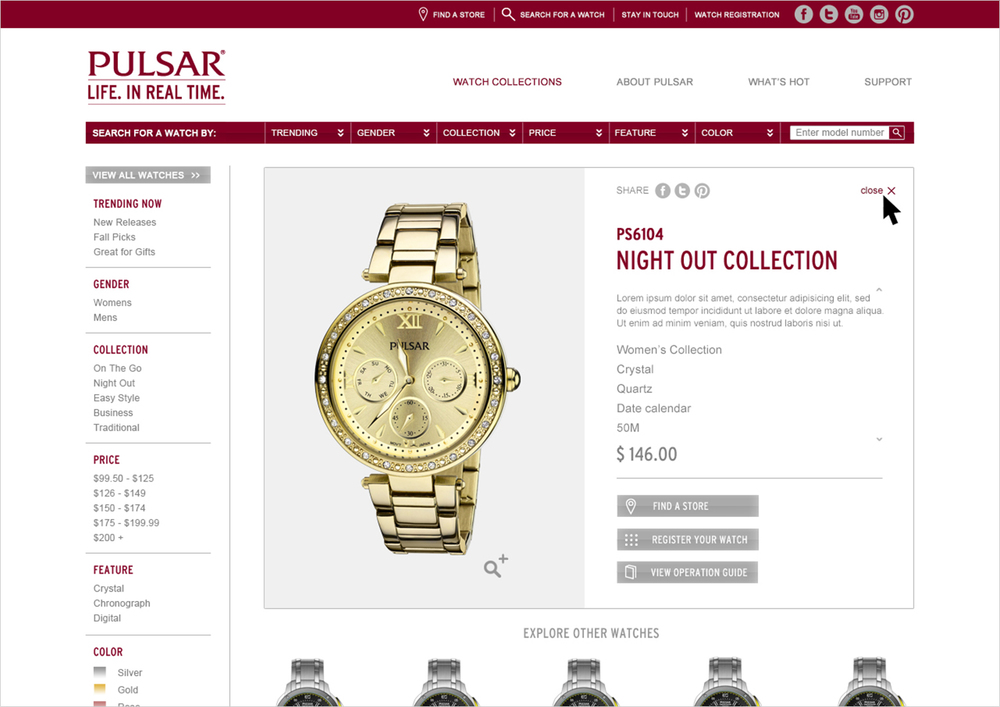
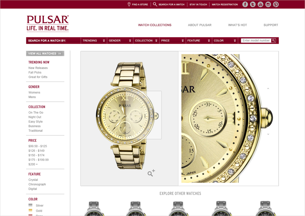
Product catalog
Shopping cart
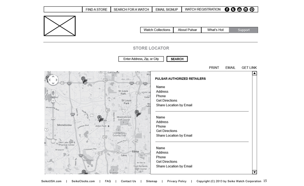
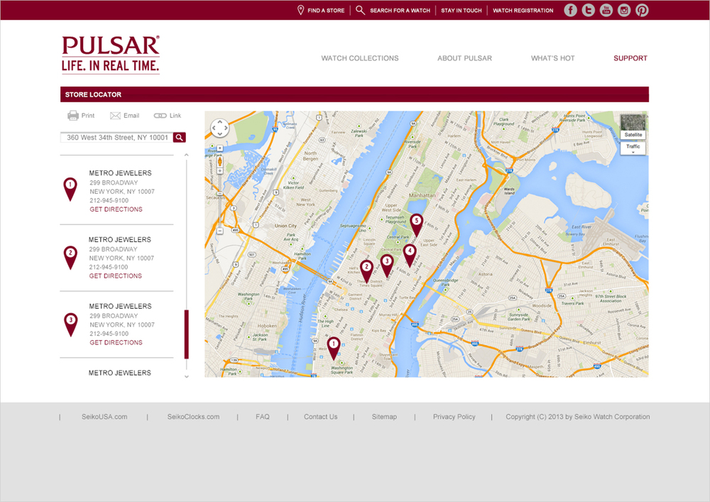
Store locator
Social media contest
Responsive
The output of this phase is a tech requirement document for all parties: client, agency, and vendor.
3
stakeholders
5
team members

persona:
The Good-Find Buyer
Professionals at the early start of their careers. They care about being stylish, as long as they can afford it.
Age: 20 - 32
Low medium high income
Diverse ethnicity and backgrounds
Social influencer
Interested in nostalgic and classic style
“
I need something on trend that works with everything that I own…,without going broke.
”
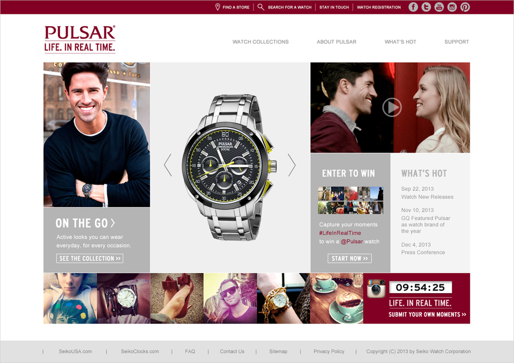
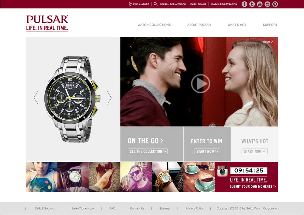
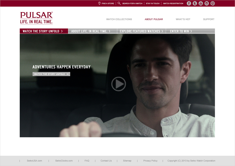
User Experience Design
PRIORITIZE KEY CALL-TO-ACTION AT EVERY STEP OF THE JOURNEY
The challenge of any content-heavy website is the abundance of actions that users can take. For Pulsar customers, they want to browse the product catalog, find a way to buy, and maybe get rewarded for the way they already engage socially.
Annotated for design and development
information architect + sitemap
With clear information flow and user path

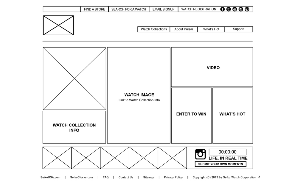
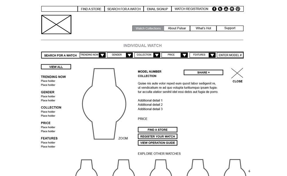
Wireframe
With focused information hierarchy and call-to-action on every screen
highlighted blocks denoted template pages

Bringing it to life
with design and development
Merging form and function to create a seamless experience between product and campaign
User Testing & Iterations
Getting users to test the platform by directly interacting with the dev op sites. During this testing period, we changed the user flow to minimize the number of clicks to shopping cart. We also tested the shopping cart pass-through, map and Instagram APIs to make sure it is one seamless experience.
Learning
This site experience is built very closely with the construct of the Content Management System (CMS). In fact, the design is influenced by the information architecture and building blocks of the CMS and back-end micro-services.